Correlation Analysis is a well-known analytical technique used to test if there is a relation between two quantities, for example did a marketing campaign lead to an increase in sales or as the price of one stock rises and falls does the price of another stock also rise or fall in synch.
Determining if there is a correlation can be exploited:
- a marketing campaign that isn’t impacting sales can be cancelled to save costs or if it is successful it can then be extended or
- ensuring that a portfolio has good diversity so that if one investment suddenly drops it is less likely that all other investments will also drop.
The aim of this article is to review what correlation analysis is and then use a worked example to understand how to implement correlation analysis using SAP Business Objects Web Intelligence.
What is Correlation Analysis
In general, correlation analysis answers the question: does this quantity change when this other quantity changes. Correlation is seen everywhere: as weather gets hotter sales of ice cream increase, there is a correlation between income in health where high earners have better health than low earners, there is a well-known and proven correlation between smoking and lung cancer.
A correlation can be positive –two quantities move in the same direction or negative – the quantities move in opposite directions. An example of a positive correlation is where an increase in customer numbers leads to an increase in complaints. And an example of a negative correlation is as sales of sun glasses goes up the sales of gloves and scarves goes down.
Note, the terms positive and negative do not refer to the value of the quantity going up or down but whether the two quantities being analysed both move up or down (positive correlation) or whether the value of one quantity goes up while the other goes down (negative correlation).
The use of positive or negative to describe correlation in this way comes from a statistical measure of the correlation between two quantities. This measure ranges from -1 to +1 where -1 means that the there is a strong negative correlation between the two quantities and +1 means that there is a strong positive correlation.
This statistical measure is useful as it quantifies the amount of correlation and therefore it can be used to compare the correlation in one pair of items to the correlation in a different pair – for example you can determine that there is a stronger correlation between sales of gloves and scarves compared to say sales of hats and scarves. Later we will look at how to calculate this statistical measure but first a quick but important note on correlation and causation.
Correlation is not Causation

Courtesy of xkcd.
Correlation is used to determine if there is a dependence between two quantities however it does not prove cause and effect, that is, the change in one quantity directly causes the change in the other quantity. Here’s an example of incorrectly deriving causation from correlation:
Analysis of sales of ice cream and incidents of drowning demonstrate that as sales of ice cream increase, the rate of drowning also increases. Therefore, it can be concluded that ice cream consumption causes drowning.
Although there is a correlation between ice cream sales and drowning it is wrong to conclude that one causes the other. This example fails to account for the fact that sales of ice cream increase in the summer and so does the number of people swimming in the sea.
This subtle difference is widely exploited where having demonstrated a correlation people assume causation between the two factors. You see this all the time, deliberately or otherwise, in newspaper articles and also exploited by business and politicians.
A current debate is climate change: there is a definite correlation between increased CO2 in atmosphere and increase in industrialisation in the world as a whole but the debate is whether industrialisation has in fact caused the CO2 increase or is it just coincidence.
An article in the Telegraph Red meat and butter ‘could raise Alzheimer’s risk‘ is an example of journalism picking up on a correlation and then implying that there is causation. What other factors do you think could be involved here?
Correlation Analysis Methods
There are several methods of measuring correlation with each method used in different situations. The Pearson Product Moment Correlation is used when the relation between the two quantities (variables) is expected to be linear, that is, the change in the quantities is in equal rates. If the relation is not linear then a rank correlation can be used such as the Spearman Rank Order Correlation or the Kendall Rank Order Correlation.
Other measures of correlation have been developed for more complex relationships such as cyclical or elliptical variation.
This article will look at how to calculate the Pearson Correlation Coefficient.
Implementation
Two look at how to implement correlation analysis using Web Intelligence we’ll analyse the sales of Gin and Tonic at a supermarket.
Requirement
Alison works in stock control and she wants to know if the sales of Gin increase do the sales of Tonic Water also increase. She has received some anecdotal evidence from shop managers but she wants to know for certain. Her requirement is to show that the sales of gin correlate with sales of tonic.
First Chart our Data
Alison has been sent the file gin_and_tonic_sales_data which is a sales report of sales of gin and tonic over the last year. Alison creates a new Web Intelligence Rich Client document and imports this data as a personal data provider,
- Start Web Intelligence Rich Client
- Create a new report based on a Text data source
- Select the file of sales data
- On the query panel change Week from a measure to a dimension and run the query to import the data into Web Intelligence
When doing statistical analysis our first step is always to chart the data – a visual inspection of the data can give us insight to decide and confirm that our analytical approach is correct. Alison plots sales quantity against week and obtains the following chart.
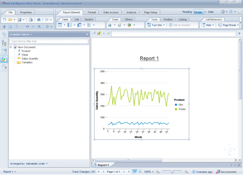
To create this chart,
- Select the table, right click and select “Turn Into”, “Cross Table”
- Then right click again and select “Turn Into”, “Line Chart”
Looking at this chart it is hard to spot if indeed sales of Tonic rise and fall in line with a rise and fall in sales of Gin so Alison then charts the data as a scatter chart.
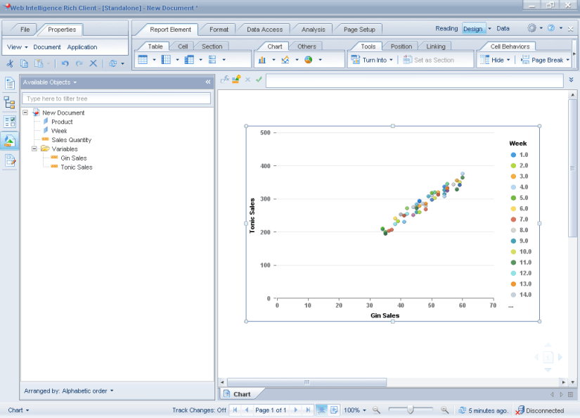
This scatter chart displays sales of Gin on the x-axis and sales of Tonic on the y-axis and it is now much clearer that there is a strong correlation between the sales of each.
This graph isn’t so simple to produce as Web Intelligence requires separate measures for each axis of a scatter graph, currently we have a single measure [sales quantity] but we use the dimension value [product] to differentiate. Alison used the following steps to produce the scatter graph.
- First create two variables to split the sales data into two measures: one for sales of gin and the other for sales of tonic.
| Variable Name | Type | Formula |
|---|---|---|
| [Gin Sales] | measure | =[Sales Quantity] where([Product] = “Gin”) |
| [Tonic Sales] | measure | =[Sales Quantity] where([Product] = “Tonic”) |
- Next add a new tab to the document add create a new table using the [Week ], [Gin Sales] and [Tonic Sales] objects
- Right click over the table and select “Turn Into…”, “More Transformations”
- In the dialog select “Point” type and then Scatter Chart
The object for “Value Axis 1” should be [Gin Sales], the object Value Axis 2 should be Tonic Sales and the Region Colour should be [Week].
Note, if we don’t include the [Week] object for region colour Web Intelligence performs an auto sum of the measure values for [Gin Sales] and [Tonic Sales] and our scatter chart just displays a single point. Personally I find this behaviour somewhat odd as a scatter chart will always use two measures on each axis and would probably not want them aggregated in this way.
Quantify the Correlation
Alison wants to quantify this correlation so that she can say whether the correlation is strong or weak and also so that it can be compared against possible correlations in other products. She does this by calculating the Pearson’s Correlation Coefficient.
Pearson’s correlation coefficient when applied to a sample is commonly represented by the letter r and is calculated using the following formula,
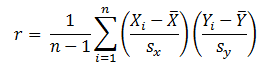
where
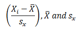
are the standard score, average and standard deviation for the two quantities.
To implement the above formula in Web Intelligence,
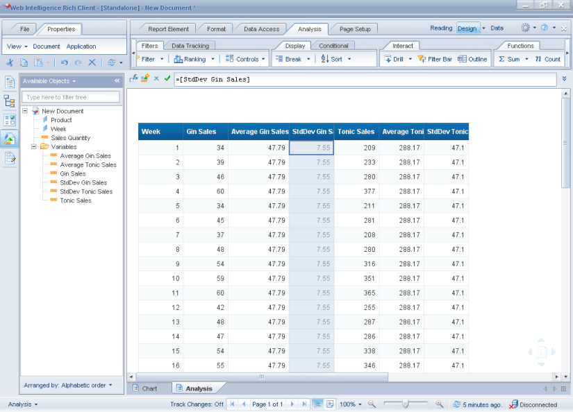
- First add another tab to the document and create a new table of [Week], [Gin Sales] and [Tonic Sales]
- Next create 4 new variables,
| Variable Name | Type | Formula |
|---|---|---|
| [Average Gin Sales] | measure | =Average([Gin Sales]) ForAll([Week]) |
| [StdDev Gin Sales] | measure | =StdDev([Gin Sales]) ForAll([Week]) |
| [Average Tonic Sales] | measure | =Average([Tonic Sales]) ForAll([Week]) |
| [StdDev Tonic Sales] | measure | =StdDev([Tonic Sales]) ForAll([Week]) |
- Add these to the table to check that they calculate correctly.
Note the use of the calculation context used in the formula so that the average and standard deviation is calculated across all values.
- Now we calculate the Standard Scores for X and Y, again using calculation context to make sure the formula calculate correctly
| Variable Name | Type | Formula |
|---|---|---|
| [Standard Score Gin Sales] | measure | =Sum( ([Gin Sales] ForEach([Week]) – [Average Gin Sales]) / [StdDev Gin Sales] ) |
| [Standard Score Tonic Sales] | measure | =Sum( ([Tonic Sales] ForEach([Week]) – [Average Tonic Sales]) / [StdDev Tonic Sales] ) |
- Display the table footer and add the following formula in the footer in the last column,
=Sum([Standard Score Gin Sales]*[ Standard Score Tonic Sales])
- Finally multiply this by 1/(n-1)
=Sum([Standard Score Gin Sales]*[ Standard Score Tonic Sales])*1/(Count([Week])-1)
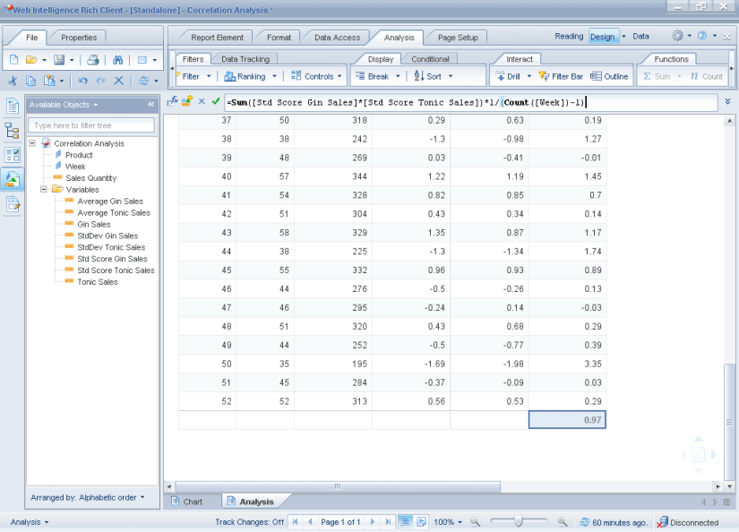
This value 0.97 is the Pearson Correlation Coefficient.
The Pearson Correlation Coefficient ranges in value from -1 to 1 where the larger the value the stronger the correlation. Alison can now use this value to compare to correlation between other products.
Conclusion
Measuring the correlation between two quantities provides a quantifiable method of measure the correlation between two quantities.
Web Intelligence doesn’t have a single function to calculate the Pearson Correlation Coefficient but can be derived using other formula.
See also,
Linear Regression Analysis and Web Intelligence
Further reading,
Wikipedia, the Free Encylopedia: Pearson product-moment correlation coefficient
Laerd Statistics: Pearson Product-Moment Correlation
vcefurthermaths: Maths Tutorial: Pearson’s correlation coefficient (statistics)
